Suppose you just obtained a fresh new set of data. You might know what it’s generally about, but the only way you can know what hypotheses to test (and what analysis challenges you’re up against) is to explore the data and audit its overall quality. Unless you can see the basic overview of what you’re dealing with, you won’t be able to determine the most appropriate models to build or develop a strategy for handling challenges such as outliers and missing values.

For these reasons, exploratory data analysis is regarded as an important step in data mining methodologies.
What is exploratory data analysis?
The overarching concept of exploratory data analysis (EDA) was first advocated by John Tukey. His foundational work on EDA, published in the late 1970s, championed the idea of assessing the data before rushing into testing hypotheses and building models. Since that time, EDA has become an integral part of data mining methodologies, including CRISP-DM, KDD, and SEMMA. The goal of EDA is to get an overall feel for the data you’re about to spend time analyzing so that you can better address the key analysis questions and objectives.
Specifically, some of the key purposes of exploratory analysis include:
- Obtaining an overview of the data
- Discover patterns
- Frame hypotheses
- Check assumptions
- Gathering general statistical information about the data
- Distribution
- Key statistics (mean, median, range, standard deviation, etc.)
- Detecting data anomalies
- Outliers
- Missing Data
Graphical visualization methods comprise the majority of EDA techniques, but non-graphical quantitative measures are just as important to incorporate. More information on specific EDA techniques is available from sources such as this handbook from the NIST Information Technology Laboratory.
Exploratory analysis using PolyAnalyst
Users of PolyAnalyst know that the system comes with a wide variety of analysis features for handling structured data as well as text. And for basic EDA, the system’s data loading nodes automatically provide a convenient view of the overall data patterns from a univariate perspective.
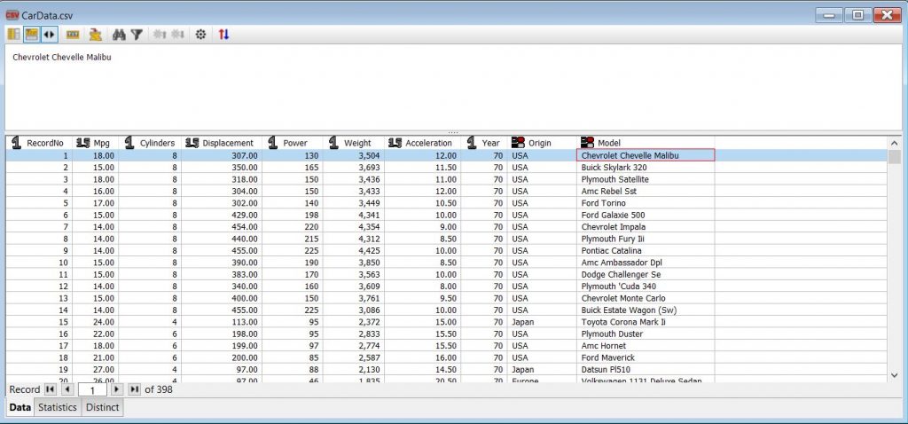
For example, if we load an example dataset containing car data, the analyst can obtain a basic overview of the dataset variables and the data types by viewing the data in tabular form.
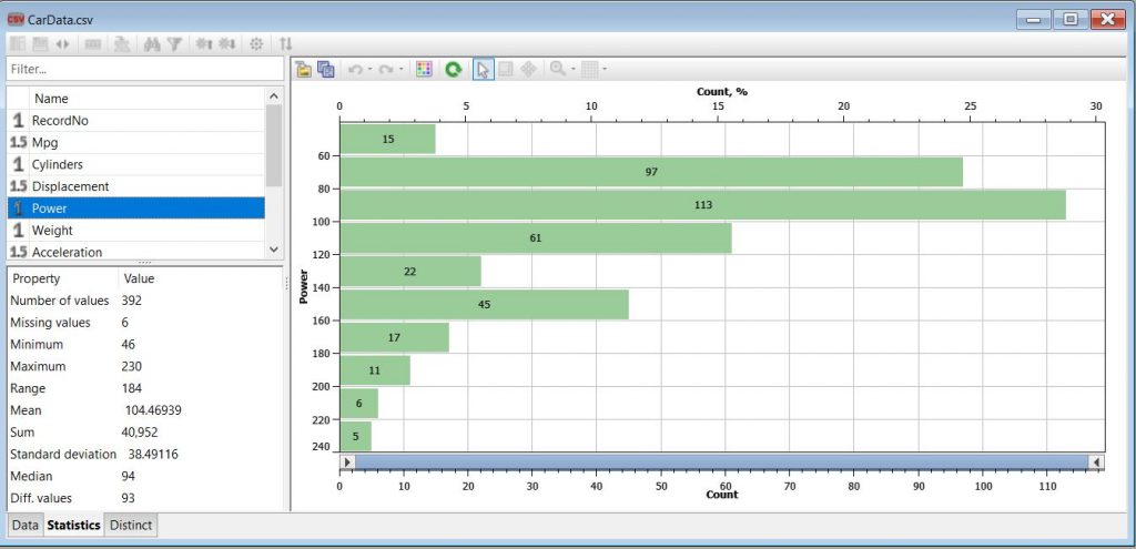
In the Statistics tab of a dataset node, the various statistics for each variable are presented for quick assessment of data anomalies, such as outliers and missing data. For example, in the car data, we can see the mean, median, range, and standard deviation of the Power variable, and we observe that there are 6 missing values.
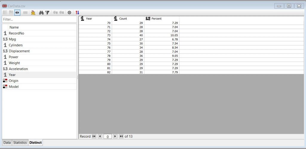
Finally, the Distinct tab lists all the unique values a selected variable has within the dataset along with the relative percentage distribution among those values. In the case of the example car data, we can view all the Year values for the cars in the dataset as well as their relative distribution.
PolyAnalyst’s built-in EDA tools
From the basic overview provided in any PolyAnalyst data node, we can begin to formulate a plan for how to proceed with data cleansing and analysis. And to compare sets of variables against each other for a bivariate (or multivariate) analysis, the various chart nodes (such as bar charts and scatter plots) are very quick to set up and view relationships among variables. But there are a few additional built-in tools in PolyAnalyst for EDA that are worth highlighting, such as the Data Audit node and the Distribution Analysis node.
Let’s now go over these tools briefly and see how they work.
Data Audit Node

In PolyAnalyst, the Data Audit node is a built-in tool for exploring your data. It is useful when first examining a new dataset and provides lots of information you can quickly scan to gain preliminary insights into your dataset. This node serves as a summarization node, so it does not connect up to additional downstream analysis nodes in the project script. Its main purpose is to guide your decision making on how to cleanse, prepare, and analyze your data.
The node settings allow you to specify which columns (i.e., variables) to analyze and whether or not to perform both summary statistics and anomaly detection. The resulting report shows a synopsis of the statistics and anomaly metrics, which are useful to consider prior to applying a predictive model or classification model.
Here’s an example of the node output when analyzing a crime data example dataset, which lists the date, district, category, and description of various crime reports:
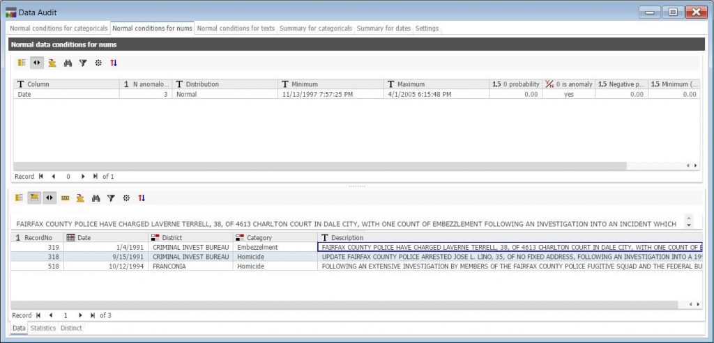
The data audit output report consists of multiple tabs that assess the data for anomalies, arranged according to the data type (i.e., categorical, numerical, text). Summary statistics for each variable are also listed in the report under different tabs. In the example above, the system has identified and presented in the lower pane three potentially anomalous records with dates outside of the expected range covering the vast majority of records (years 1997-2005).
Distribution Analysis Node
The Distribution Analysis node in PolyAnalyst is a helpful tool for analyzing trends and distributions of numerical data values in a dataset. Along with calculating statistical characteristics, the node recognizes distributions (normal, exponential, double exponential, log-normal, and uniform), performs general hypothesis testing,
and groups variables based on those tests. When setting up this node, the user can specify which variables to analyze, as well as the significance levels, tail properties, and other parameters of the statistical tests to be performed.
The resulting report contains a list of the statistical tests that have been conducted as well as their results. The output report will also show information like the fitted distributions and labeled tails, which can later be appended as a separate column to the original dataset. The Distribution Analysis node also conveniently connects to other analysis nodes to pass its results to predictive modeling and machine learning.
Let’s see how this works using the car data from our earlier example:
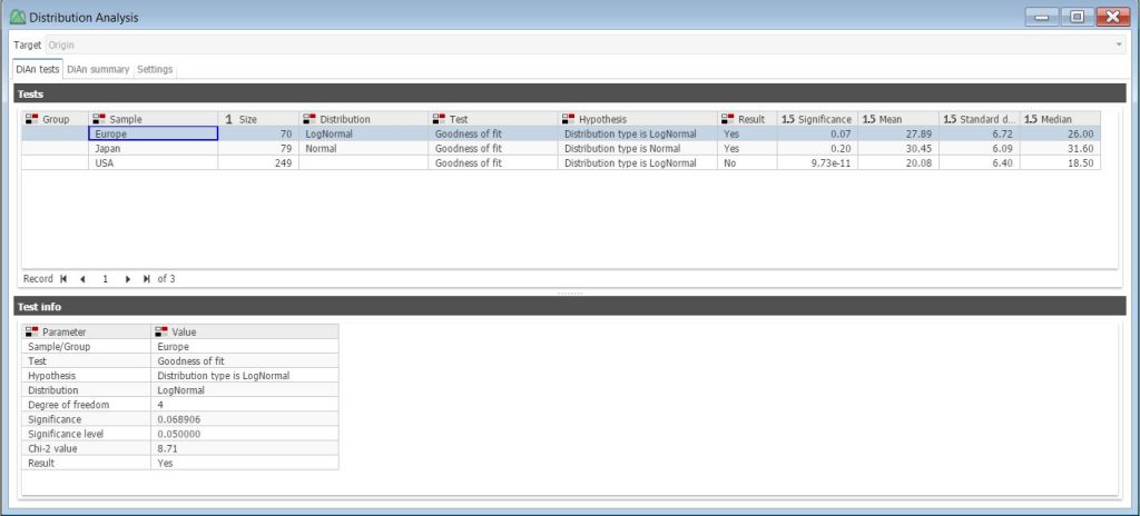
The distribution analysis performed here was set up to analyze the patterns for the MPG variable in data records representing individual cars, grouped by a car’s Origin (i.e., Europe, Japan, USA). The resulting report displays the MPG distribution type for each Origin group along with other statistics in the top table. By highlighting a specific Origin group (e.g., Europe), the user can view the test parameter information that resulted in assigning this sample a log-normal distribution.
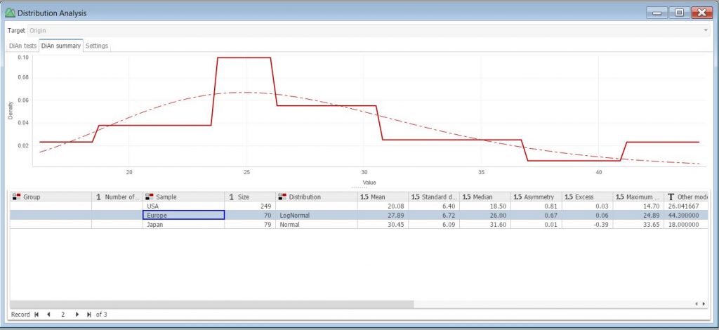
On the summary tab, a fitted distribution chart is displayed for the selected subset. For example, if we select the Europe subset, we can see the log-normal curve fitting of the data.
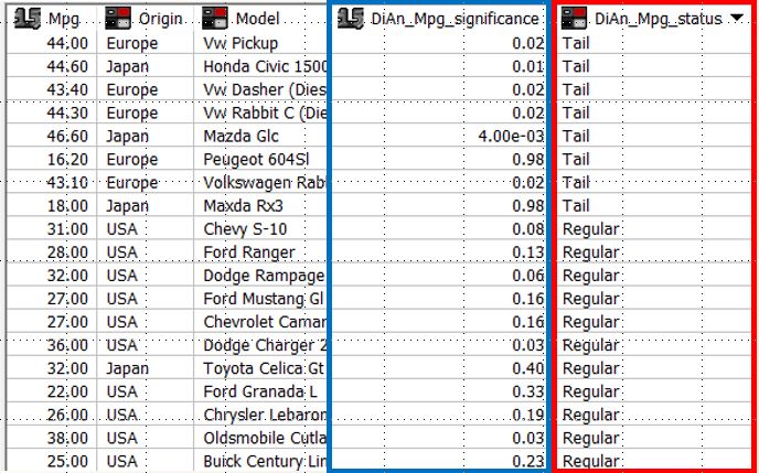
Conveniently, the information obtained from the distribution analysis can be scored against the dataset to create an additional column. For example, in the image below we can see the scored values for MPG significance (blue box) and status (red box) from our distribution analysis appended to the car dataset, which can be useful for analyzing anomalies (marked by the system as belonging to either the upper or lower Tails of the identified distribution).
Keep in mind, however, that these PolyAnalyst’s built-in EDA tools are only a couple of techniques that can be employed when assessing data quality. There are, of course, more analysis features in PolyAnalyst that analysts can use to conduct EDA. You can check out this page for more information on the types of analysis nodes and capabilities in PolyAnalyst. Feel free to contact us for a live demo of these features if you’re interested in learning more.
