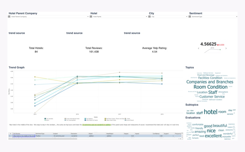
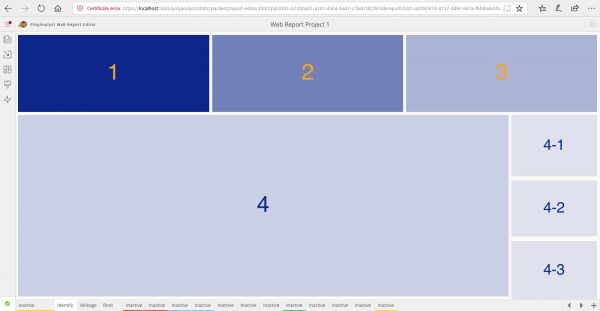
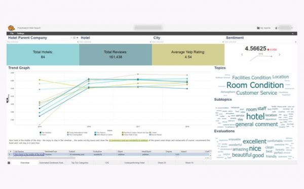
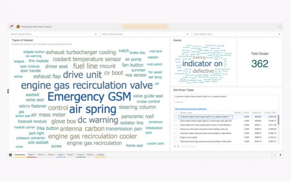
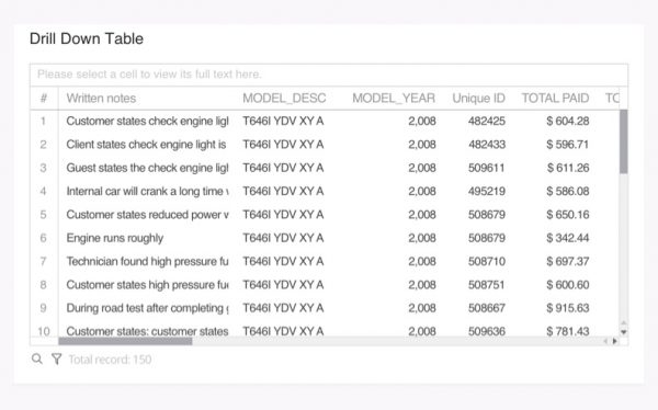
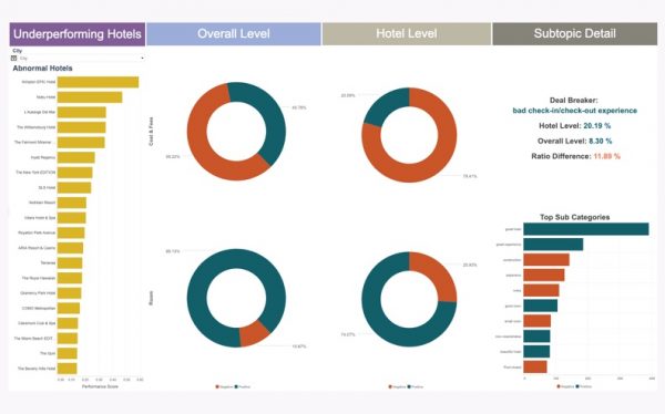
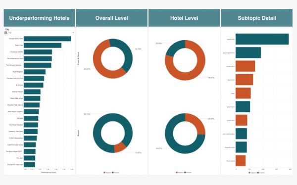
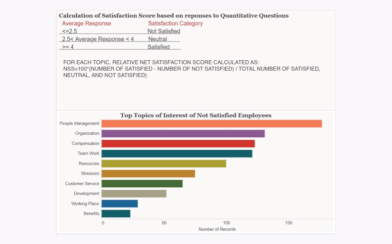
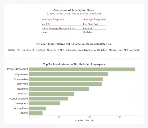
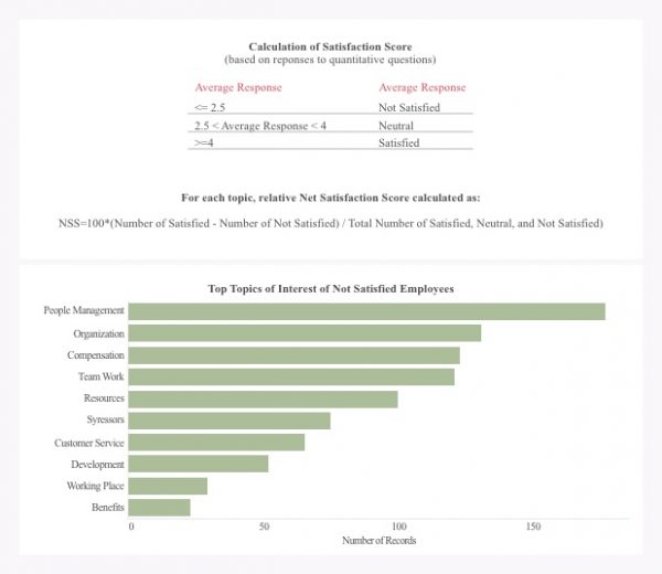
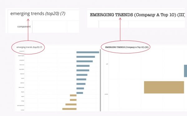
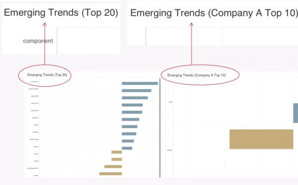
Helping data analysts create effective dashboards is a key task for User Experience (UX) designers. Incorporating multiple components into a unified report involves more than just a general knowledge of the user interface (UI) and UX. Even for seasoned UX designers, a great amount of effort is spent on distilling large amounts of complex information into a simple, clear storytelling report. As PolyAnalyst™ software UX designers, we work hard to incorporate web reporting features that enable users to create meaningful and interactive dashboards.
Recently, we received feedback from our users asking us for some tips on how to beautify their reports and make them more effective. In response, we decided to share a few tips on creating better dashboards and web reports, including some of the DO’s and DON’Ts for building them.

