Creating reports with PolyAnalyst is a great way to illustrate the insight that you gained from analysis. However, creating a nice looking report can be challenging. For example, how do you decide which results to display at the top of your report? How will viewers of the report interact with it? We are happy to provide you some tips for building better looking reports.
Planning comes first. Your objective of creating a report is to encapsulate and demonstrate what you have learned. You need to focus on your audience and ensure your design facilitates your audience getting their questions answered.
Tip #1. Design the front page
There is no fixed way to build the first page. You design it based on how you would like to tell your story. It could be a title page with an image of the product from your data, an overview of the data, or a visualization of your most striking result. If you choose to create an overview page, we recommend that you include basic information on the key columns contributing to your main results. Engaging overview pages often use a combination of bar charts, pie charts, filters, link graphs, word clouds and drill-down tables to show demographic and summary information. An overview page serves to introduce the audience to the key features of the data and helps the audience better understand your results and insights that follow.
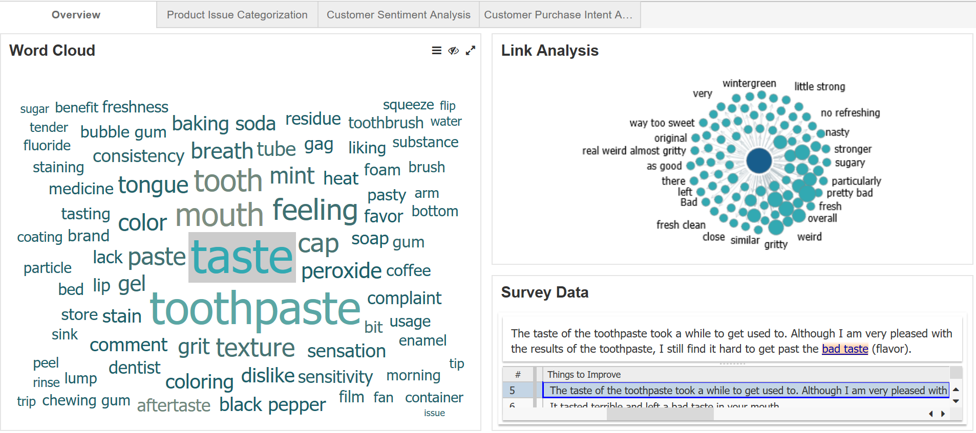
In the example below, we have the first page for a web report that analyzed customer opinions on a toothpaste. When clicking on a keyword in the word cloud, both the link analysis and survey data table get updated accordingly. Currently, the keyword “taste” is being selected, so all associated visualizations and data tables are updated automatically to results relevant to this keyword.
Tip #2. Use a variety of tools
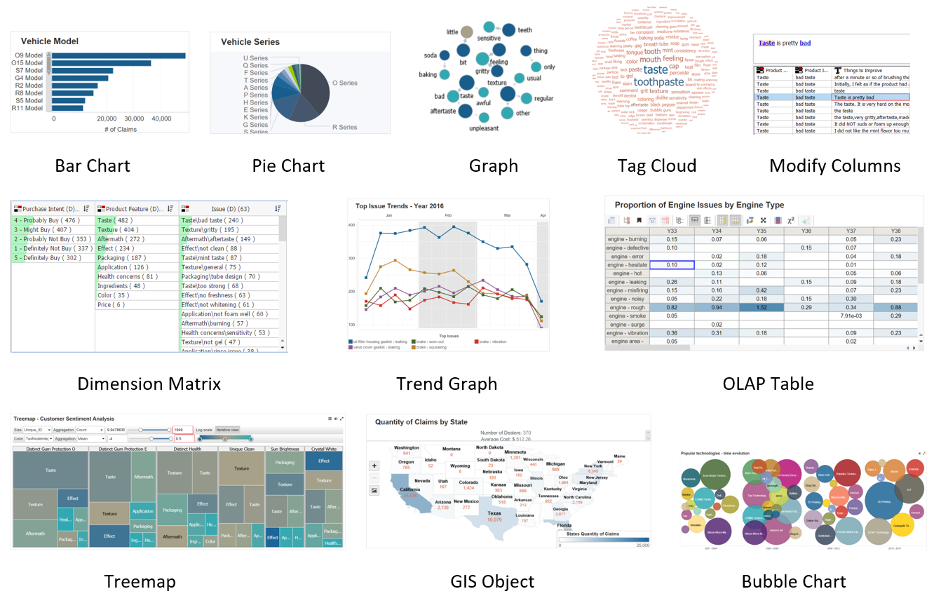
To make the report more vivid and engaging, try including a variety of visualizations, keeping in mind the questions you intend to answer. Some of our favorite visualization nodes include: Bar Chart, Pie Chart, Graph node, Tag Cloud, Modify Columns (as drill-down tables), Dimension Matrix, Trend Graph, OLAP Table, Treemap, GIS Object, and Bubble Chart. Here is a screenshot demonstrating some of these visualizations:
Note that the overview page under tip #1 shows a word cloud using the Tag Cloud node, a link analysis using the Graph node, and a drill-down table of the survey data from a Modify Columns node.
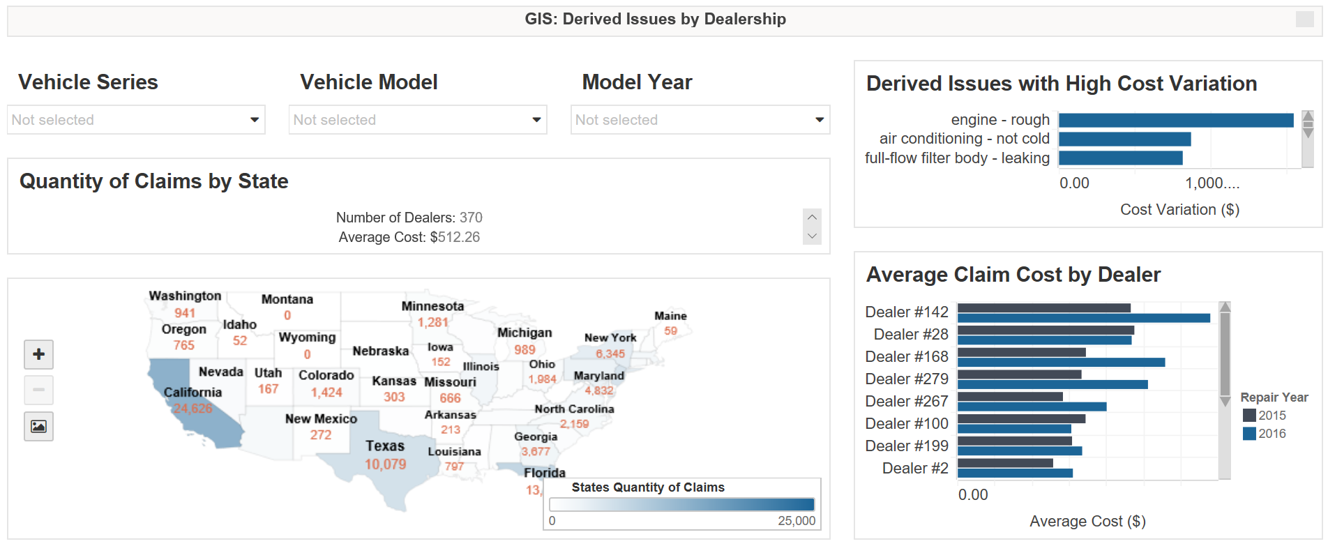
In addition to the usual visualizations, you can generate interest with interactive tools such as a statistic widget or a variety of filters. In the screenshot “GIS: Derived Issues by Dealership” in the next section, the “Quantity of Claims by State” component is an example of a statistic widget.
Tip #3. Choose meaningful filters
Using meaningful filters is a powerful strategy for discovering business insights in the data. Interactive filters allow you to drill down to specific detailed segments of data, while weeding out records irrelevant to your specific business concern. In general, you may find location and date information to be helpful filters. Depending on your project, you may find other useful filters. For example, for the analysis of a dataset of car warranty claims meaningful filters include vehicle series, model, production year, and engine type.
Tip #4. Utilize customization options
Usually, we need to modify the default settings of some visualization charts to meet our needs. For example, depending on how much space you have for the chart, you may need to adjust the font size, remove the legend, or modify the component’s margins. You can explore the customization options in the header menu (including component properties, enhanced drill down, and so on) and the menu bar (including file, sheet, window and settings). Also, you can rename your page titles and charts to reflect the information or results that you want to show. Suitable titles greatly help the audience correctly understand your points. In sum, the ultimate goal of using customization options is to make it more convenient for the audience to quickly absorb the information and better understand your point of view.
Tip #5. Choose a thoughtful color palette
Coloring your charts is also an important part of a report. Be thoughtful and pick a color palette that is likely to catch your audience’s eye without distracting them from the analysis. A safe choice is a color palette that is consistent with the logo and website colors of your intended audience. For more information on how to color your web report, please read: Using color to increase the Visual Effectiveness of Reports.
Tip #6. Organize your pages
First, have a business story in mind. Then, according to the flow of your story, arrange the pages in your report to support that story. It can be difficult to follow pages that jump around different topics, so try to make your story smooth and compelling by putting related pages together.
For example, if you are working on a project that analyzes customer reviews, we typically begin with an overview of the data (e.g., demographic distribution, main topics, etc.). Then in subsequent pages we can show overall customer sentiment and drill down to more specific angles, such as negative sentiment in certain locations using the GIS map or overall growth in positive or negative sentiment of certain topics.
With these tips and tricks in mind, you can begin enhancing your web report to convey your business insights effectively. Have fun playing around with different visualization nodes, filters, customization options, and color palettes. We look forward to seeing your stunning web reports!


