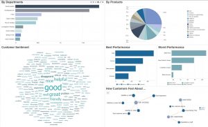
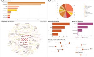
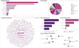
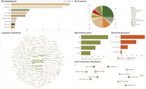
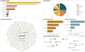
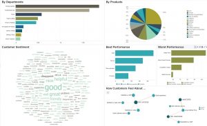
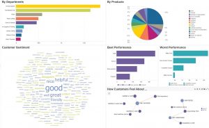
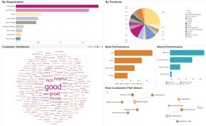
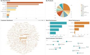
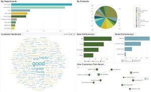
With the evolution of the PolyAnalyst™ web reporting software, new color palettes and exciting features have recently been launched. Users will now have the option to globally change and share color palettes within a web report by using the auto-sync feature. Pre-packaged color palettes will also be available in the newest versions, enabling users to apply a color mood to their report. Additionally, if the user prefers to apply a corporate or custom color palette, this option will also be available.
Why talk about color moods?
 In the blog post “Using color to increase the visual effectiveness of reports,” we discussed how color affects the audience in a meaningful way. This was the impetus for establishing color moods in PolyAnalyst. As a modern approach to PolyAnalyst’s original color palette, “color moods” are the way we envisioned to help users spend more time worrying about the accuracy of the results and less about polishing reports so they are well received. The results don’t always speak for themselves to all audiences, so it’s important we make every effort to help important insights stand in the spotlight.
One way we worked to achieve this goal was by enabling users to easily apply global, specialized color palettes to the report’s visual components being published. Each color mood has a theme and has been repeatedly tested to ensure it offers an out-of-the-box, harmoniously-balanced color option while also effectively distinguishing numerous slices of data. This feature draws from color theories and color formulas, eliminating the struggle some users may have in choosing the right color and refining color balance. Unless the user has a corporate color palette, this is a way to achieve well-balanced visuals for reporting.
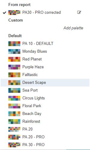
In addition to having access to the default palettes and 10 built-in color moods, PolyAnalyst users can choose to add additional colors to any of the palettes. And there is also still the option of creating your own custom color palettes for yourself or for others to use in their projects. These features are intended to increase flexibility and assist marketing for control on branding standards.
What is the inspiration behind each color mood?
The phrase “color mood” is the appropriate terminology for describing the color palette in the new PolyAnalyst interface because each collection was inspired by a feeling or connection to a specific place in time; therefore, we are invoking a mood with each color choice. When custom color moods are in development, a designer can choose to think about a location or a time where the colors added to the experience. And while the interpretation of color is subjective, the color moods are intended to elicit an emotion. Thus, in the final color collection, the colors were selected based on whether they reflected the physical landscape with objectivity while also creating a ‘feeling’ that’s picture perfect.
Each resulting color mood represents a generalized, overall expression that depicts the theme’s framework. For example, if your goal is to evoke a feeling of sincerity, then perhaps the Monday Blues color mood would be appropriate. If, however, you want to communicate energy and growth, then maybe the Rain Forest color mood would be a good choice.
Summary
In the end, color is meant to be fun, serious, inventive, revealing—basically, anything a person wants it to be. And we now offer a variety of color moods to reflect these individual preferences and needs. Providing a harmoniously-balanced color palette, with a universal option that can apply the palette over several projects, allows the user to focus more on the information and less on deciding which colors work well together. We also have the PA 20 – PRO and PA 30 – PRO default color palettes, which contain colors that were pulled from the individual color moods. These expanded palettes will accommodate larger result blocks in your pie charts and line graphs, eliminating color redundancy in a majority of the cases.
Check out the 10 new color moods below. Hopefully, you will discover the perfect color mood for your next PolyAnalyst™ project. Enjoy.
Monday Blues
Combining blues and greys, this color mood aims to recreate how a person feels on Monday morning when they are not particularly happy that the weekend is over. It’s like singing the blues with dark skies overhead. While the feeling behind the palette has a little bit of despair, the blues in this color mood evoke general trustworthiness for solid business performance.
Red Planet
This color mood is a homage to the planet Mars, and it will have anyone seeing lots of red. Usually red represents a stop color, but in this case, we are embracing red (as some organizations’ brands have) and offsetting the collection by including complementary colors like purple, orange, and gold. The warm tones may represent a report built on a hot summer day or complement a company’s red logo. And for the advanced color experts, a green logo would also be complemented by the multitude of red in this color mood.
Purple Haze
Any Jimi Hendrix fans? What about Rick Springfield in the 1980s? Prince? Or maybe purple is just the best color on the planet? The royal color mood combines purples, pinks, and greys for a lusciously rich color collection. The inclusion of greys into this palette allows the brightness of the purples and pinks to shine brightly and provides a mid-tone for balance.
Falltastic
Fall + Fantastic = a color palette that embraces the seasonal changing of the tree leaves in fall. This color mood is inspired by the most beloved Midwestern season for the colors, the smells, and warm sweaters. This color collection combines greens, browns, yellows, and a splash of red that will complement any brand that contains red or green colors.
Desert Scape
Imagine a clear sky, sand, cacti, and red rock. Or a sunset at the Grand Canyon. This color mood creates a vivid depiction of what one would see gazing upon any US southwestern landscape. While most call it a dry heat, this color mood will heat up your web reporting with the contrasting colors of sand, sky blue, evergreen, and sunset red.
Sea Port
The foundation of this color mood is inspired by a cool spring day in Seattle, Washington. It captures the essence of the greenery, water, boats, and breathtaking view of the Puget Sound from the famous Public Market. This color collection is a bit angsty in mood, with a splash of java, and it pulls together variations of greens and greys. It’s a very sleek color palette that provides high contrast, ranging from soft pastels to deep woodsy grey.
Circus Lights
Cue the clown music! Bright lights, lots of colors, happy and vivacious — best describe this rainbow palette. This brightly focused color collection is intended to reflect cheerful and carefree times when a big yellow smiley face joins “flower power” and they all lived happily ever after. If your typical report insights or colors are bringing down the mood, maybe it’s time to try this unicorn palette. After all, neon is making a comeback within the fashion industry, so maybe your next report could be on the fashion best-dressed list!
Floral Park
Picture a summertime picnic in the park, surrounded by sweet-smelling pastoral flowers. This color mood combines the softer side of those colors by incorporating delicate shades of pinks, purples, yellows, and greens. This is the perfect color choice for reports that need to ease into the results with a sense of calmness.
Beach Day
Take lots of sand, warm sunshine, crashing waves, a striped beach chair, and a cold mimosa—we’ve just described the colors in this mood. The use of blues and oranges in this color palette complement each other and reflect a nautical theme. Creams and beige colors are also present to balance out the brighter colors.
Rain Forest
Picture a secluded island with thick vegetation. There’s a light mist, and the sun is peeking through the canopy. And as you’re exploring, a beautiful waterfall appears. Deep colors—rich with greens, blues, and a splash of golden yellow—create this mood. For strong reporting and those with adventurous souls, try this earthy and nature-driven color mood.

